On this page I'll talk in-depth about the contact-tracing algorithms developed. User location data is analyzed to identify contact events between two users. The data is then cleaned, organized, and processed to output actionable insight for both users, public health, and life science divisions.
For access to the algorithm github respository, please contact me for more info.
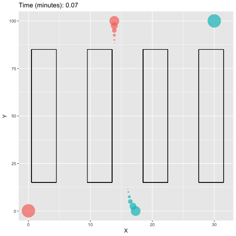
For the purpose of simulation, x and y coordinate positioning data was used with an associated time stamp for each coordinate.
Example: The simulation shows two people entering an aisle in a supermarket. Person B (blue) tries to practice social distancing, but ends up near Person A (red) for a brief period of time.

We can significantly reduce the volume of data we are comparing via compression and chunking. Our day is usually
somewhat structured. Because of this we can use compression to narrow an infected user’s location data to a
dictionary of unique GPS coordinates.
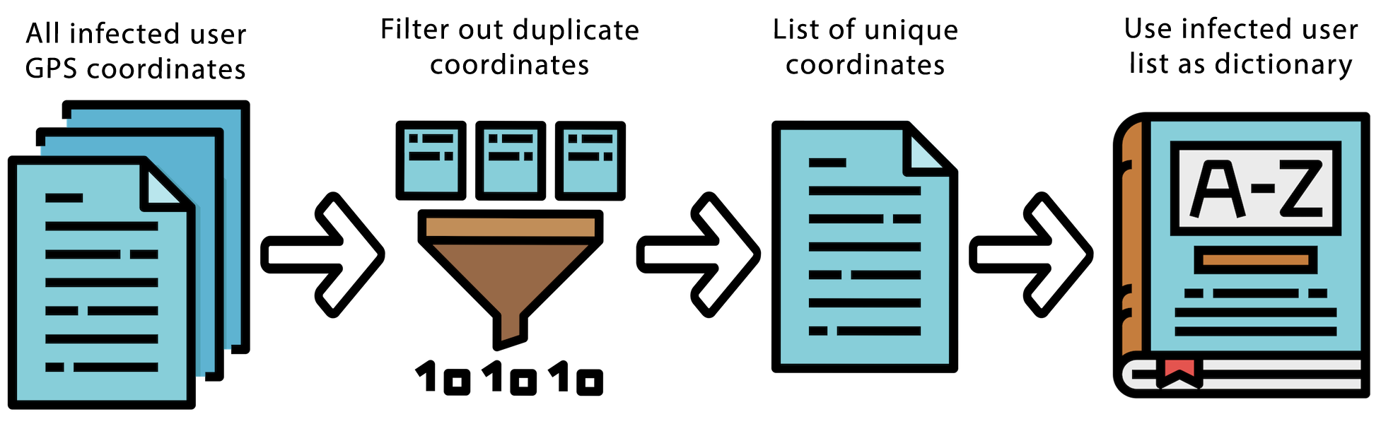 The infected user’s dictionary is then compared to other user data for contact interaction events. We can then
chunk sections of geographical areas into nested categories (such as GPS coordinates grouped by zip code, which are
sub-sectioned into 500 squared meter blocks). This simplifies user GPS coordinates to plain numbers, which we can
use to quickly compare if two users were in the same general area.
To get a better sense of how compression and chunking is effective for this type of data, lets calculate an estimated
reduction in data pre- versus post- compression. If we estimate people spend between ~41% to ~65% (or more)
of their day doing repetitive tasks, we can theoretically reduce our dataset by ~38% to ~60% (30,587 to 48,430
datapoints). Chunking can be used to further simplify our comparison of two user’s locations to larger sections
of geographical areas (like 500 squared meter blocks). If the data set is especially large, we can further compress
our dictionaries using chunk identifiers like zip code (but at a significant loss of time-stamp details).
For details about my calculations please read below:
The infected user’s dictionary is then compared to other user data for contact interaction events. We can then
chunk sections of geographical areas into nested categories (such as GPS coordinates grouped by zip code, which are
sub-sectioned into 500 squared meter blocks). This simplifies user GPS coordinates to plain numbers, which we can
use to quickly compare if two users were in the same general area.
To get a better sense of how compression and chunking is effective for this type of data, lets calculate an estimated
reduction in data pre- versus post- compression. If we estimate people spend between ~41% to ~65% (or more)
of their day doing repetitive tasks, we can theoretically reduce our dataset by ~38% to ~60% (30,587 to 48,430
datapoints). Chunking can be used to further simplify our comparison of two user’s locations to larger sections
of geographical areas (like 500 squared meter blocks). If the data set is especially large, we can further compress
our dictionaries using chunk identifiers like zip code (but at a significant loss of time-stamp details).
For details about my calculations please read below:
If we ping a user’s location every 15 seconds and examine 14 days’ worth of data (two-week incubation period) we have 80,640 datapoints (4 pings/min x 60 min/hr x 24 hr/day x 14 days). According to Deloitte reports, we can estimate people spend between ~41% to ~65% or more of their day doing repetitive tasks such as stationary work, watching tv, or sleeping. Such that the lower end (41%) represents someone who watches 0 hours of TV, sleeps 6 hours, and does 3.8 hours of stationary work. And the higher end (65%) represents someone who watches 2.9 hours of TV, sleeps 9 hours, and does 3.8 hours of stationary work. This equates to 2,475 to 3,986 unique data points (assuming 2,352 to 3,787 points represents a 95% consistency with 5% deviance from the norm). Where the 2,352 to 3,787 data points was: 41% to 65% or 9.84 to 15.6 hours x 60 min/hr x 4 pings/min. Thus, we are reducing our dataset by ~38% to ~60% (30,587 to 48,430 datapoints).
A primary component of this analysis is the distance between the two people. For the simulation, I used Pythagorean theorem to analyze the distance between two users at a given point in time. GPS location data is not as simple to process. Latitude and longitude require the haversine formula to calculate the orthodromic distance between two points (or shortest distance along the surface of the earth). Such that:

where

and

such that R is earth’s radius, φ is latitude, and λ is longitude.
For a more detailed description of the haversine formula I highly recommend this article.

We clean and organize the data for our analysis. After calculating the distance between points, the data is then sorted using a Boolean expression to locate interactions between users. If a user is within a specified number of feet (6 feet for the simulation, as per CDC's guidelines) the interaction is flagged. Next, we count the number of consecutive data points where an interaction occurred. This allows us to quantify the duration of each interaction and exclude any unimportant contact events (such as walking past someone). We then apply a minimum consecutive-value requirement that filters the identified contact events for only events that contain X number of datapoints (or more) such that X can be modified at the discretion of the analyst.
The user dashboard populates with a number of metrics a user may find useful. Including average distance from other users, shortest distance at any given time, and a social distance grade. User metrics can also be compared to the averages of other users with similar age, sex, and other demographic characteristics. Demographic information in tandem with contact events provide risk of infection probability estimates that are more accurate than demographic information alone.


The social distance grade for each user is calculated using average skewedness across the user's contact events. For each contact event, a distribution of contact is created. The distribution is then analyzed for directional skew and categorically graded based on WHO and CDC social distancing guidelines from A, B, C, D, to F depending on the skew of the distribution from > 1 to < -1 respectively.